How I Make Artful Editorial Prints

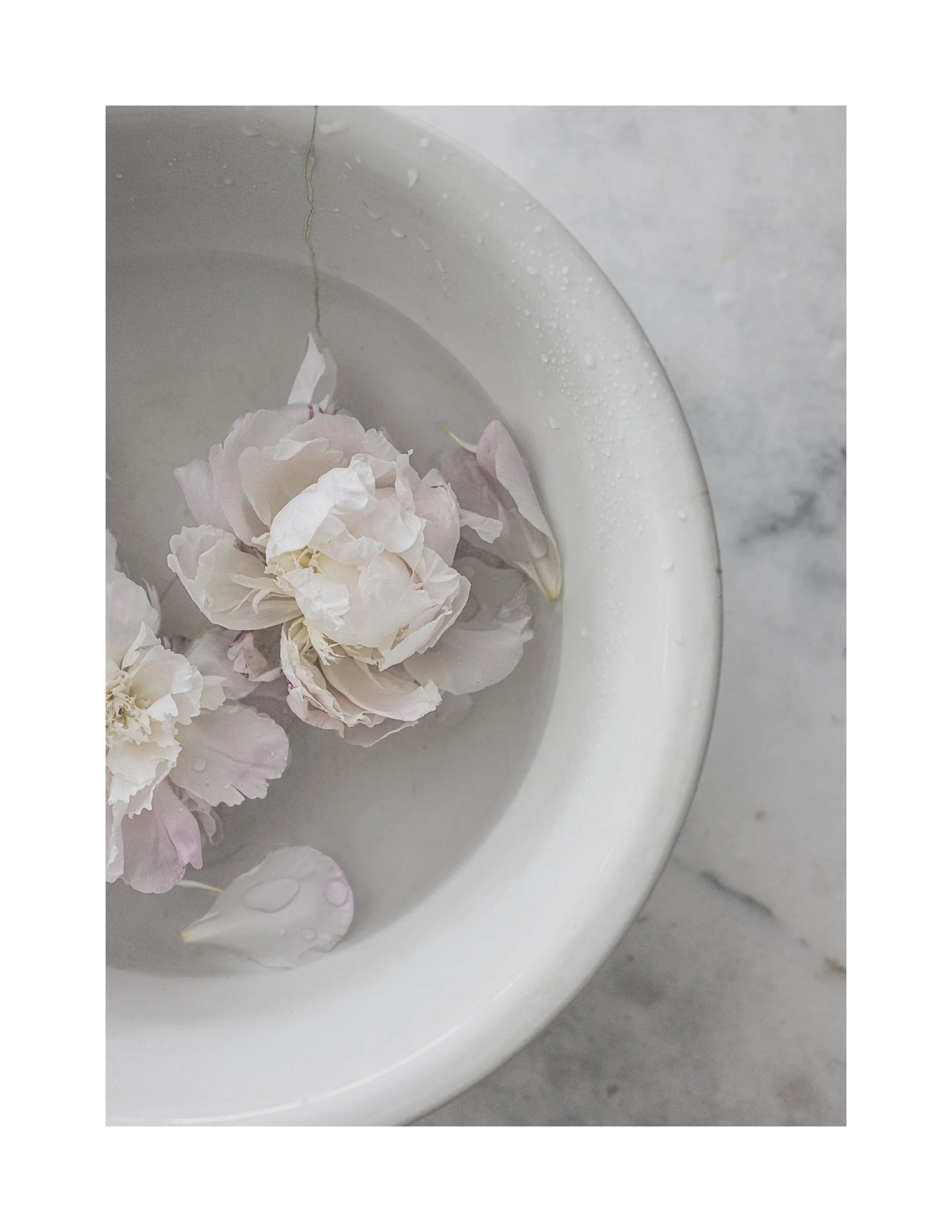
It’s been months, maybe even a year, since I last printed my photos. And oh my word, I've missed it. Thank you, peonies, for the inspiration!
Drawing from my favorite matte paper design books and beautiful magazines (think early-day Kinfolk), I’m excited to share this start-to-finish artful editing tutorial with you today.
In today’s post, you’ll find:
Step-by-step guidance on creating moody, artful prints
My favorite matte photo paper and my current printer of choice.
Tips for achieving an editorial, matte look with the matte presets from the Studio collection.
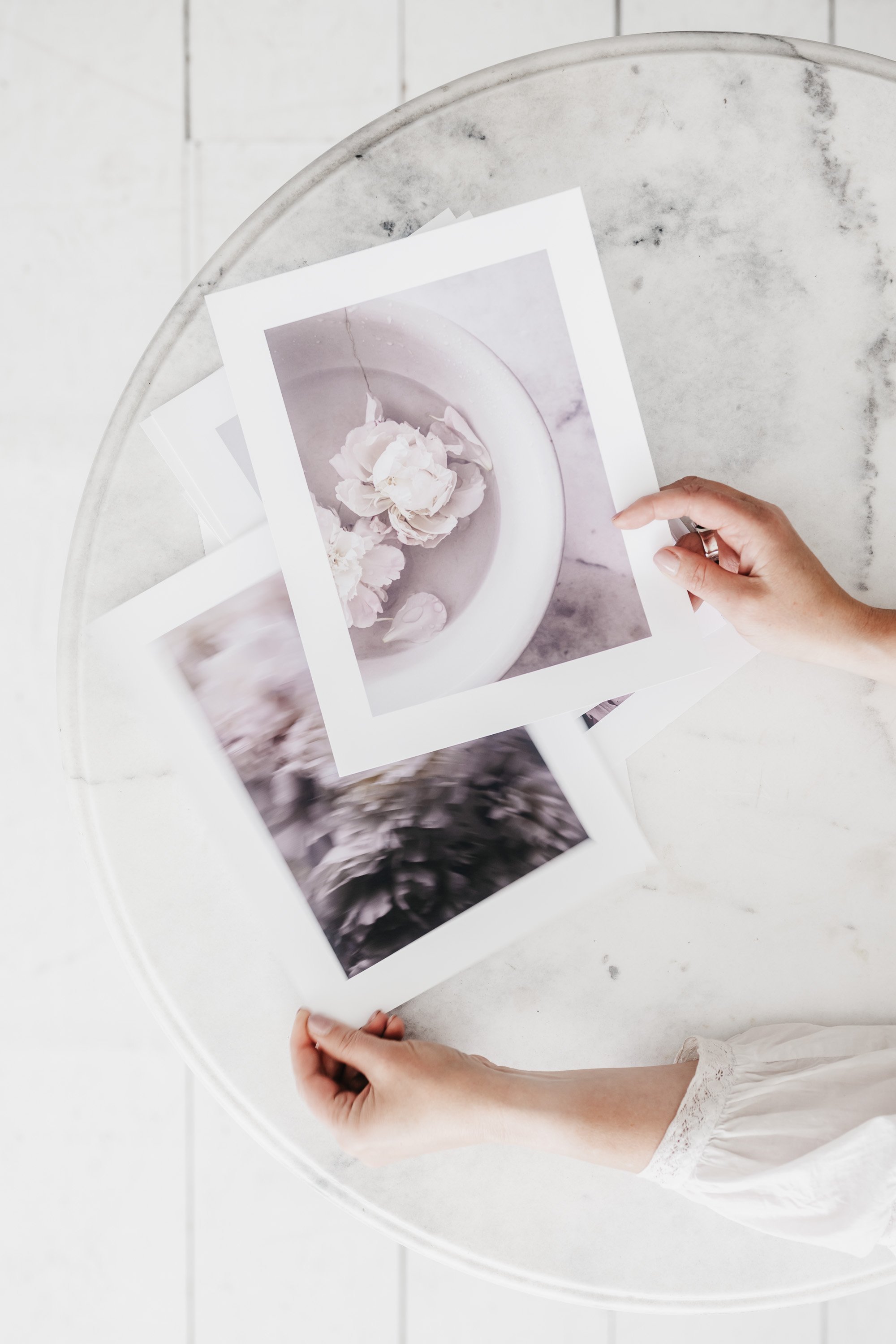
Slide to Reveal the Before/After using the Quiet Dreams matte preset.


Let’s Dive Into the Edit & Print Layout Setup
Today’s Links
Red River Double-Sided Polar Matte Paper (I used 8.5x11.)
This is my Epson Printer.
It’s economically priced and I love that it’s wide format but it can be a bit persnickety with thicker paper (80 lb+), and the ink does adds up. But I love the quality and color is beautiful.Save 50% off the Studio collection (limited-time offer)
Please note: some links contain my affiliate info. If you make a purchase I may receive a small commission. Thank you for your support.
Today’s Photo Details
Nikon z8, NIKKOR Z 50mm f/1.8 S Lens
ISO 160 | f/3.2 | 1/125
Quiet Dreams from the Studio Collection for an editorial look.
One More. Edited with Serendipitous from the Complete Studio Collection.

That’s a Wrap
Thanks so much for stopping by. Feel free to share your questions and thoughts (even hello) in the comments below.
I love knowing you were here.
With love & gratitude.
xx
Kim