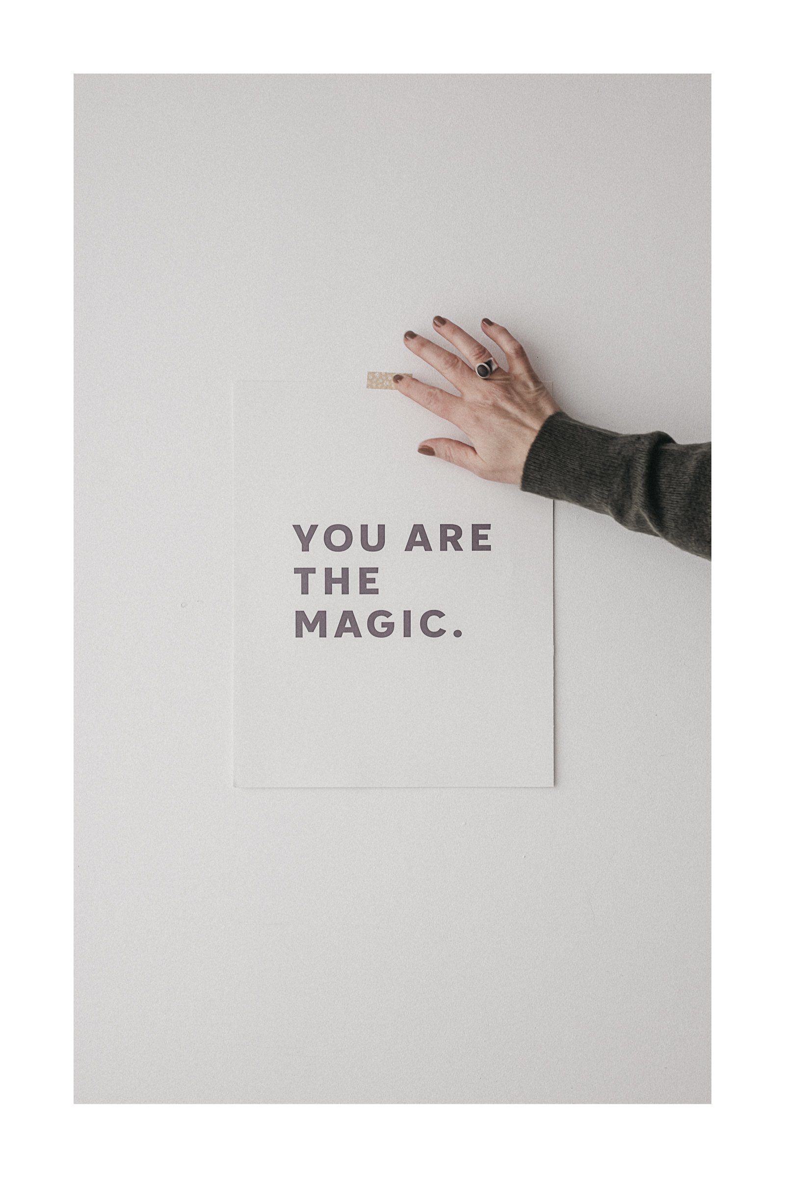
Why White Space Works: Simple Tips for Minimalist Design
how less is so often more
I’m constantly reminded that less really is more, especially when it comes to visual storytelling.
Time and time again, I see so many beautiful elements competing for attention when, in reality, all they need is a bit of breathing room.
You know that feeling when you walk into a cluttered room, and it’s hard to focus? Our visuals can feel the same way.
Today, I want to share a little ‘white space’ magic with you.
I’ve been building a mood board over on Cosmos, filled with minimal branding inspiration—perfect examples of white space done right.
Because white space isn’t just emptiness. It’s intentional, thoughtful, and truly beautiful.
Let's Dive into the Mood Board
To Sum Things Up
1. Gentle Tones
The first thing that stands out when I look at these designs is how soft, muted tones create this wonderful sense of calm. Think beige, cream, greige, earthy shades—all the calm colors that make you want to exhale. These colors create harmony, and when paired with white space, they let the visuals breathe beautifully.
Neutrals don’t have to be boring—they're like a gentle invitation to focus on what matters. So, the next time you’re designing, try simplifying your color palette and notice how much lighter and clearer everything feels.
2. Typography Needs Space, Too
I believe your text should feel just as intentional as your images. When you allow enough room around your words, they become more impactful.
On the mood board, you’ll see a lot of clean, simple fonts with plenty of breathing room. The text isn’t crowded or fighting for attention. It stands confidently, inviting the reader to slow down and take it in. Let your words speak with purpose, and remember in design, less is so often more.
3. Texture for Depth and Warmth
Minimalist doesn’t mean your designs need to feel cold. Texture can add depth and warmth even in the most simple of designs. Grain, noise, subtle paper finishes, and natural materials —so good.
4. White Space on Purpose.
This might be the most important lesson of all. White space isn’t just the absence of content—it’s there on purpose. It gives the viewer a chance to pause, reflect, and focus on what matters. It’s like giving your design some breathing room—an invitation to the viewer to linger a little longer.
When you remove the unnecessary clutter, what’s left becomes even more meaningful.
That’s a Wrap
Thanks so much for stopping by. Feel free to share your questions and thoughts (even a little hey, hello) in the comments below.
I love knowing you were here.
With love & gratitude.
xx
Kim
p.s.
For more lovely White Space inspiration, check out my Cosmos.


Learn how to use Lightroom Classic’s print module to create clean diptychs, white borders, and grid layouts—no extra apps needed.