Designing Diptychs, Magazine Layouts and More with the Lightroom Classic Print Module
Step-by-Step Tutorial and Free Templates

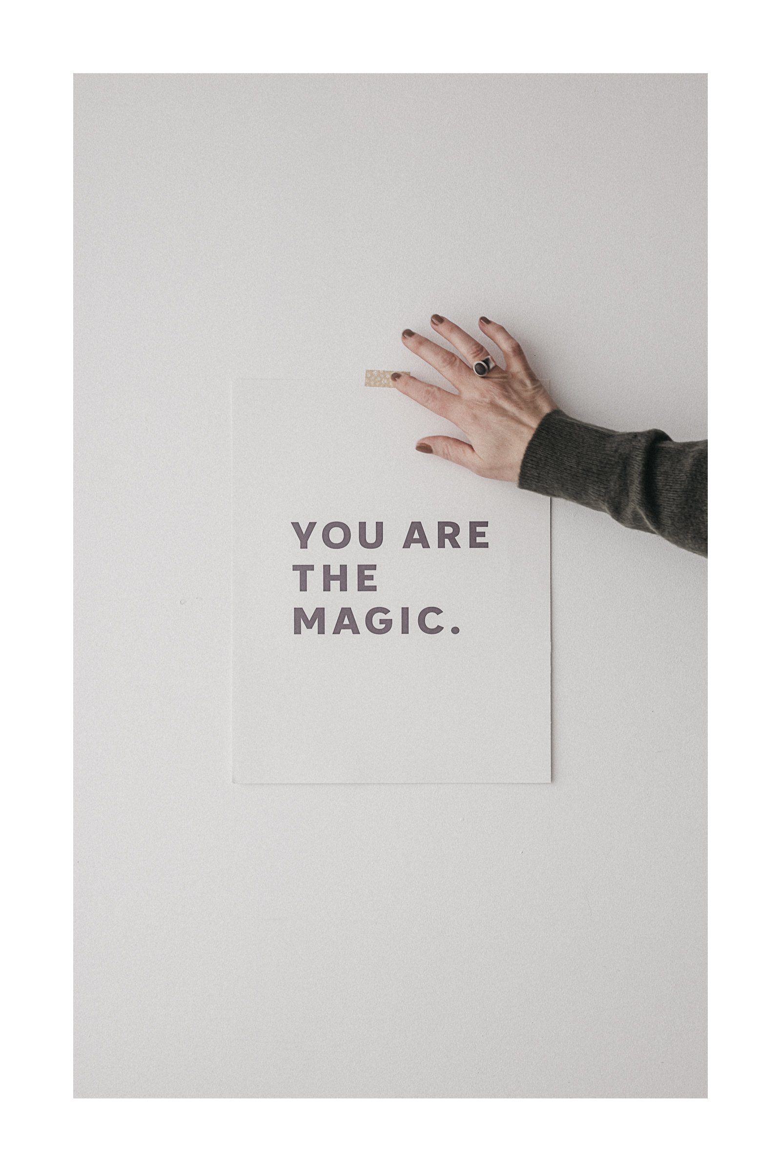
I’m obsessed with white space and white borders. Room to breathe almost always leaves room to feel something.
A simple white matte can take a framed photo from nice to so nice. Same goes for digital.
Today we’re revisiting the Lightroom Classic print module.
It might not be ‘the latest thing’, but even in 2025—it’s still the simplest way to create clean photo layouts. Diptychs. White borders. Grid prints. On and on I could go.
I made a quick tutorial to walk you through how to create these layouts inside Lightroom Classic.
No extra apps. No complex steps.
Step-by-Step
☐ Watch the video above.
☐ Then scroll down to grab the free template files (yours to enjoy).
☐ Try them with a few of your favourite shots—see what works.
And if you create something you love?
Come back and share a link to your bordered print, magazine layout… or a diptych, if you’re feeling inspired.
Speaking of diptychs—
They’re trickier than they look. The balance, the story, the rhythm between two images.
So good when it works.

Here are a few thoughts to guide your next diptych:
☐ Match tone, not subject. The two images don’t need to be of the same thing—just feel like they’re from the same world.
☐ Think in pairs. Look for photos that naturally speak to each other. A beginning and an end. A detail and a wider view. A question and a quiet answer.
☐ One from above, one straight on. It’s a simple pairing that often just works. The shift in perspective adds subtle rhythm.
☐ Consider scale. A close-up beside a pulled-back frame creates visual tension that draws the eye.
☐ Use light as the thread. Morning light paired with dusk won’t often sit well—unless that’s the story you’re telling.
☐ Go neutral with edits. When the photos are working together, you don’t want competing color grades pulling them apart.
☐ Avoid symmetry traps. Too much mirroring feels forced. Let them echo, not mimic.
☐ Leave room. Negative space in one photo can balance detail in the other.
☐ Crop with care. Pay attention to how the edges of each frame interact. Do they cut off abruptly or flow gently?
☐ Trust your gut. If something feels a little off, it probably is. Try another pairing.
☐ Give it time. The best diptychs often come from browsing your archives slowly, not rushing a match.
Lightroom makes it easy to try combinations without commitment.
White borders and soft spacing bring it all together.
Now it’s your turn—
Design a layout, try a diptych, and if you feel like sharing, I’d love to see what you create.
Pop the link in the comments below. ♡
xx
Kim
You Might Also Enjoy


Learn how to use Lightroom Classic’s print module to create clean diptychs, white borders, and grid layouts—no extra apps needed.